


What the New Normals of Climate Change in the U.S. Look Like
Climate change is a hot-button topic these days. Weather extremes have made plenty of headlines of late. But despite the immediate trending nature of it all, changes in climatic averages aren’t something that takes place overnight. The latest iteration of NOAA’s U.S. Climate Normals report is a good example of this.
Every 10 years, the government agency releases an analysis of U.S. weather of the past three decades that calculates average values for temperature, rainfall, and other conditions. Among the many contributors to the report, farmers have played a large role for helping harvest and record data.
For the past decade, the “normals” have been based on weather observations from 1981 to 2010. This month, climate experts at NOAA’s National Centers for Environmental Information (NCEI) issued an updated collection based on the weather occurring from 1991 to 2020.
So, what do the updated averages indicate for the U.S.? A glance at the NCEI maps below appear to show a progression toward a much warmer and wetter normal.
NOAA scientists say the influence of long-term global warming is obvious: The earliest map in the series has the most widespread and darkest blues, and the most recent map has the most widespread and darkest reds.
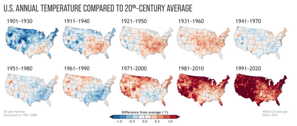
Annual U.S. temperature compared to the 20th-century average for each U.S. Climate Normals period from 1901-1930 (upper left) to 1991-2020 (lower right). (NOAA NCEI)
In the collection of precipitation maps, NOAA points out that few places exhibit a precipitation trend that is either steadily wetter or steadily drier than the 20th-century average. Instead, drier areas and wetter areas shift back and forth without an obvious pattern.
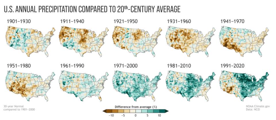
Places where the normal annual precipitation was 12.5 percent or more below the 20th-century average are darkest brown; places where normal annual precipitation was 12.5 percent or more wetter than the 20th-century average are darkest green. Maps by NOAA Climate.gov, based on analysis by Jared Rennie, North Carolina Institute for Climate Studies/NCEI
NOAA still takes into account of what used to be normal in regard to climate. Its monthly and annual climate monitoring reports, temperature averages, and precipitation totals are ranked in the climate record dating to 1895; while U.S. and global climate conditions are compared to the 20th-Century average.
On a related note, NOAA forecasters say La Niña conditions have ended and estimate about a 67% chance that neutral climate phase conditions will continue through the summer. Stay tuned for how that might impact the Atlantic hurricane season. A little less than a year ago, the agency issued a La Niña watch. The 2020 Atlantic hurricane turned out to be a record-breaking campaign for named storms.
For more on the new climate normals, you can view a collection of maps from NCEI showing both recent and long-term trends in temperature and precipitation at ncdc.noaa.gov.
Subscribe Today For