


Fruitful Info: Trace Chill Hours and More With Cool Tools
 March 11, 2025
 I imagine that all of us are looking into our respective locations to see how much chill we are accumulating this winter season.
As a brief review, and for anyone that is new to this business, we have our traditional chilling models:
- The Weinberger Model (# hours below 45˚F)
- The Modified Weinberger Model (# hours between 32˚F and 45˚F)
The data corresponding to these two models is easily accessible in AgroClimate (http://agroclimate.org/tools/chill-hours-calculator/). The UGA Weather Network (http://weather.uga.edu/) in Georgia provides this data as well. In both sites, you will find a drop-down menu, or you will be able to select a specific weather station (close to your location) and see how much chill has been accumulated. We normally select the dates between Oct. 1 to Feb. 10. There are two options for the chill degree model to be selected as described above (these are the traditional data that we have been using for a long time).
Sadly, the UGA Weather Network website does not provide data for 3) the Dynamic model. We have found in the last years that the dynamic model is proving to be better suited for our temperature variations accounting for gain and losses of chill.
The site that I have been using for obtaining the data for chill portions is https://climatetoolbox.org/tool/historical-climate-dashboard. You will need to add your location. So, click on choose location. Next, you can choose your data option. There are four panels. You need to add in two of those panels the chill calculation options. Click on the drop-down menu and you will be able to see an option for the Modified Weinberger model and one for chill portion (Dynamic model).
The nice thing about this tool is that you do not have to look for station IDs. Climatetoolbox is based on NWS (NOAA National Weather Service data). Dr. Knox (UGA Agricultural Climatologist) has described that: “The data source for the calculator appeared to be a grid based on NWS data supplemented with some other networks (but not the UGA network), and I believe it should be a reasonable source of data. Keep in mind that there are going to be some variations in local microclimate at your sites due to slope, soil type, and other factors which may make the values different than what the grid is predicting, but it’s the only place I know that you can find a chill portion calculator now.”
Another tool that was recently added to the climatetoolbox site is the Historical Climate tracker (https://climatetoolbox.org/tool/Historical-Climate-Tracker). In the drop-down menu for variable, you can find the different chill models (including now chill portions). Select dates from October to February, and you will get a graph with bars above the average as a default. There is an option in that drop-down menu to change it to scatter plot. I personally prefer that option. I think this will be a great tool to allow you to see what happened years back and relate that information to what you saw in your orchards.
An exciting new option was added last month on the AgroClimate website. This is a chill tool that includes the traditional models, but also the Dynamic model. The website for this new tool is http://agroclimate.org/chill-calculator-tool/. The use of this tool is similar to the traditional tool in AgroClimate, but with the new added feature of providing us with the chill portion data for a location. This is quite exciting as we did not have such an option before with the UGA site or AgroClimate website.
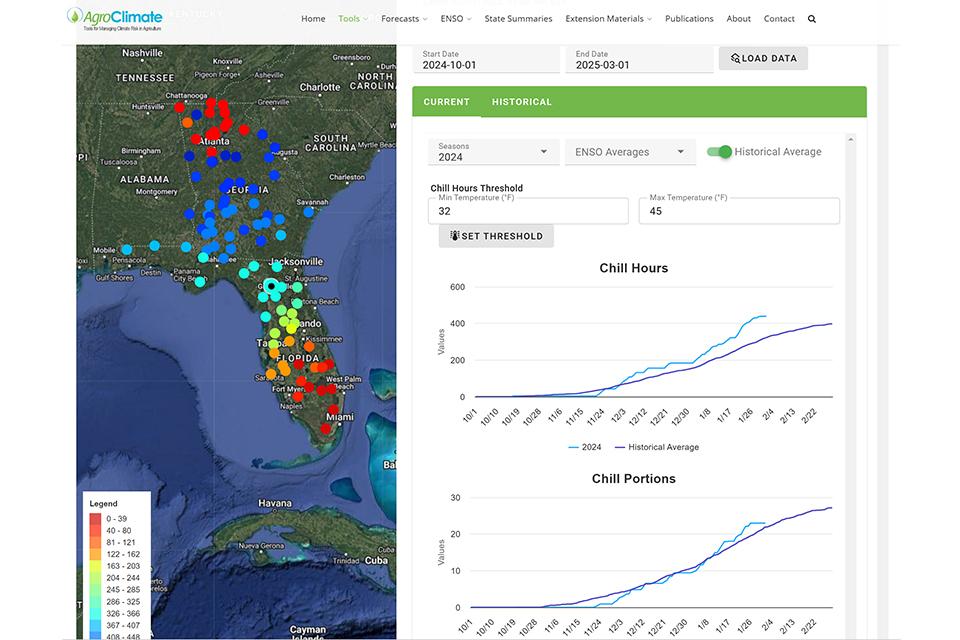
Source: Agroclimate
Finally, we added a new feature, a winter feature, to the smartirrigation peach app (https://smartirrigationapps.org/peach-app/) developed by our program. The app can be downloaded in Android and in Apple devices. The app will provide data on chill accumulation for fields created within the app for Florida and/or Georgia. Models supported by the app are the Weinberger, the Modified Weinberger, and the Dynamic models. The app uses data from weather stations located close to the farms created by the users. If you are new to the app, first you will need to create a field(s). There is a step-by-step video on the website described above.
Once you have created your fields you will be able to see the chill accumulation at each farm. You can then click on the farm and be able to access a graphical representation of the chill accumulation. In this window, you can click on the models and easily switch between the different models.
Hope all these sites and tools will help you to see how we are doing with chill this year.
Subscribe Today For